
A Pareto chart is a graphical tool used to display the relative proportions of occurrence of different values. It is named after Vilfredo Pareto, an Italian economist who developed the concept. They can be used to prioritize actions and allocate resources. Keep reading to learn more about the history of Pareto charts and how they can be used.
What are Pareto charts?
Pareto charts are graphical tools used to display the relative proportions of occurrence of different values. They are named after Vilfredo Pareto, an Italian economist who first described the concept in 1906. The history and origins of Pareto charts trace back to the early 1900s when Vilfredo Pareto observed that 80 percent of Italy’s wealth was controlled by only 20 percent of the population.
From this observation, he developed the principle that became known as the Pareto Principle or 80/20 rule, which states that, for many events, roughly 80 percent of the effects come from 20 percent of the causes. This principle has been applied in many areas, including business, engineering, and software development.
The modern-day Pareto chart was developed in the 1940s by Joseph Juran, who was also responsible for popularizing quality control methods such as statistical process control (SPC) and brainstorming. Juran’s original version was called a “Pareto diagram” and consisted of two columns. It had one column for frequencies and one for percentages with a line connecting them. In later years, Edward Tufte refined Juran’s design to create what is now known as a “Pareto chart.”
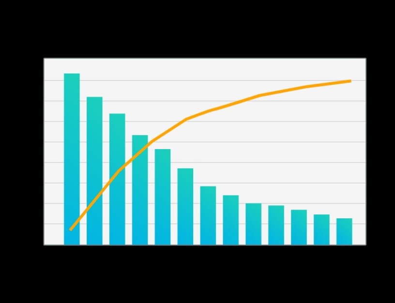
A typical Pareto chart consists of a column graph on which values are plotted in descending order from left to right. The value at which 80 percent of all occurrences fall is typically marked with a horizontal line across the top of the column.
How can Pareto charts be utilized?
The Pareto chart has evolved over time to become a more powerful tool for data analysis. Today, Pareto charts are used to identify and track the relative proportions of occurrence of different values within a given data set. There are many different ways businesses can use Pareto charts. One way is to use it to track and analyze inventory. Another way is to use it to track customer complaints. Businesses can use Pareto charts to track inventory by creating a chart that lists the different types of inventory and then ordering the inventory from most to least common. This will help businesses to identify which types of inventory are most common and need to be ordered more often.
Businesses can also use Pareto charts to track customer complaints. This can be done by creating a chart that lists the different types of complaints and then ordering the complaints from most to least common. This will help businesses to identify which types of complaints are most common and need to be addressed.
How can you read a Pareto chart?
A Pareto chart is a data visualization tool that can be used to help you identify the most important factors affecting a process. The chart can be used to prioritize potential improvements to the process. The most important factor will be the one with the highest column on the chart. To interpret a Pareto chart, first, identify the most important factor affecting the process. Then, look for the biggest contributor to that factor. The biggest contributor is the most important opportunity for improvement.
To read a Pareto chart, find the category that you are interested in on the x-axis, and then find the corresponding number on the y-axis. The percentage shown is the percentage of items in that category that are in the given category.
The history and origins of Pareto charts are important because they are a powerful tool for visualizing and understanding data. Pareto charts can help identify where to focus efforts for improvement by highlighting the areas where the most improvement is possible.
